Frontside x Dunbar: Creative Testing in Action
By Joe Kim, Founder of Frontside Consulting
Here at Frontside Consulting, we’re pretty proud of the methodology that we use to test and generate great results for our clients. We often refer to this as the “Battleship Method.”
Last summer we had the great opportunity to help out a small startup called Dunbar (www.dnbr.to). Dunbar is an event coordination app that helps people collect invites without any new account signups or new tools to learn and provides links for sharing that work equally well on social media like Facebook or Instagram and in SMS, emails, and other chat apps..
The name comes from Robin Dunbar, of “Dunbar’s number” fame: the maximum number of personal relationships that a person can reasonably maintain.
We set out to improve app engagement and set up a number of custom conversions on the dnbr.to website to track when a user signed in with their Google account, logged in on a new device, or created an event. Our goal was to improve all aspects of app engagement, primarily tracking event creations.
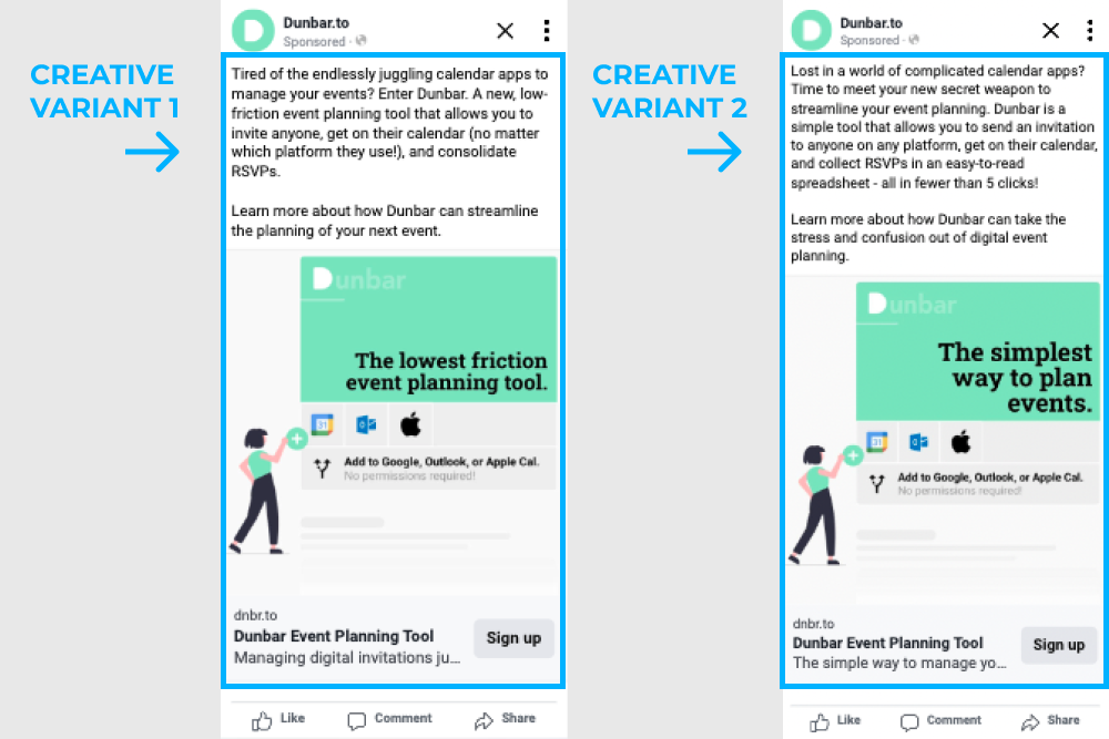
Sean McBeath, Dunbar’s founder had some initial brand work and creative for us that we started testing. We put together a few iterations of copy to see what might be the value proposition of the app that would best engage:
The overall engagement rate for this initial test of creative wasn’t great coming in at about .37% and .67% respectively. One takeaway was that the “low friction” messaging in the primary text did seem to outperform, so we stuck with that variant of the primary ad copy.
As you can see from the ad, the messaging was complex and unfocused - we were trying to communicate way too much from a single ad. We took the data back from this and tried to focus on two things: “What are you advertising?” and “What does it do?”
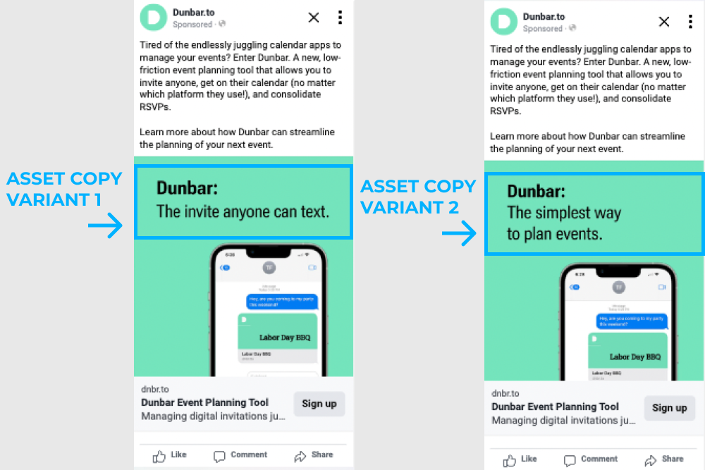
We are an invite/calendar app. Using us is simple and it reflects in the creative:
With this simplified messaging, we got link click-through rates up to 1.13%
We made sure to include a small, subtle iteration as well so focus down even further on what value propositions seemed to resonate.
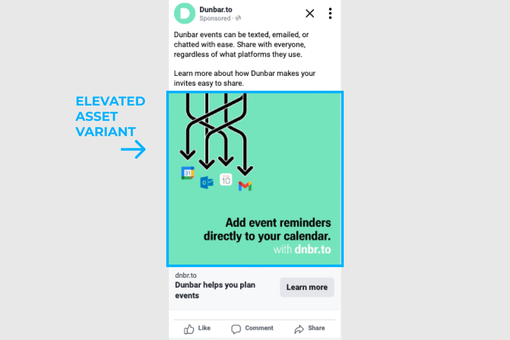
Overall, this simplified message outperformed the previous, cluttered iteration of creative and the “Invite anyone can text” messaging also slightly outperformed the other variant of copy. We also tried a little more visual example to see if the direct calendar invite functionality was the selling feature, but it didn’t outperform the simplicity messaging:
I guess this wasn’t as communicative on the functionality of Dunbar as “the invite anyone can text” - link CTR dropped down to 1.09%, although that might just be statistical noise; it wasn’t helping or hurting it appears and ties go to simplicity.
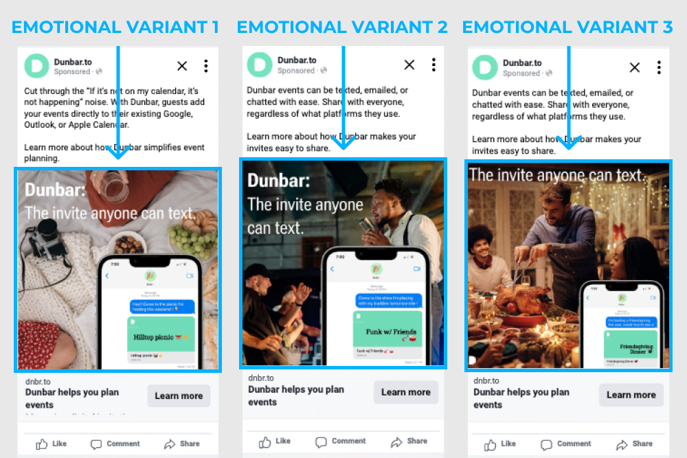
Now that we had a good understanding of the functionality that sold Dunbar, we had to start thinking about the look and feel. The friendly green was a great choice for branding, but we wanted to make sure that the potential customers understood what they were getting from Dunbar. It wasn’t just about getting people to add events to their calendars, it’s the feeling of connection, excitement, and community.
We started working that into the creative:
1.44%, 1.89% and .92% Link CTR respectively
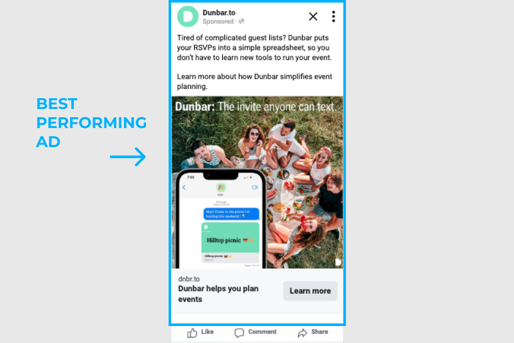
Eventually, this version became our best-performing ad:
1.96% CTR
We were able to beat that 1.96% CTR on a few occasions with seasonal messaging for Labor Day BBQ’s, but the core message stayed the same:
Dunbar will help make the joy of getting together with your friends as simple as possible.
We don’t often get the opportunity to test our methodology so thoroughly, but if you’re the kind of business that’s interested in experimenting and finding out the core value proposition that your business provides to its customers, reach out to us and let’s see how we can help you find the intersection between your value and your audience.
As always, if you enjoyed this article, please give us a follow on social media and sign up for our newsletter below so you’ll be alerted when we post new content like this.


